هیچ محصولی وجود ندارد
 نمایش بزرگتر

فیلم شطرنج بازان
محصول جدید
نام فیلم : شطرنج بازان
نام هندی: Shatranj Ke Khilari
کشور تولید کننده: هندوستان
کارگردان: Satyajit Ray
سال انتشار: 1977
- نوشتن نقد و نظر
- حذف کردن این محصول از علاقه مندی های من
- اضافه کردن این محصول به علاقه مندی های من
- چاپ
اطلاعات بیشتر
شطرنج بازها shatranj ke khilari یک فیلم هندی ساخت 1977 است که توسط ساتیجیت ری بر اساس داستان کوتاهی از منشی پریم چاند با همین نام کارگردانی شده است. فیلم در 1856 در آستانه شورش هند در سال 1857 تنظیم شده است.بریتانیا در حال برنامه ریزی برای ضمیمه کردن ایالت آواد هندوستان است . در این فیلم زندگی روزانه دو مرد ثروتمند که به شطرنج اختصاصداده شدهاند در مقابل سابقه مقامات شرکت بریتانیای شرقی هند، تاریخ روابط آن با حاکم هندی ، و از خودگذشتگی حاکم و هم عمل کردن به امور مذهبی و هم به دنبال لذت بردن از آن ، ارائه شدهاست .
Lighter, Secondary Text
The small element is used to create a lighter, secondary text in any heading:
h1 heading secondary text
h2 heading secondary text
h3 heading secondary text
h4 heading secondary text
h5 heading secondary text
h6 heading secondary text
Striped Rows
The .table-striped class adds zebra-stripes to a table:
| Firstname | Lastname | |
|---|---|---|
| John | Doe | john@example.com |
| Mary | Moe | mary@example.com |
| July | Dooley | july@example.com |
Bootstrap Tutorial
Bootstrap is the most popular HTML, CSS, and JS framework for developing responsive, mobile-first projects on the web.
This is some text.
This is another text.
Example Page Header
This is some text.
This is another text.
Well Size
Alerts
Alert Links
Add the alert-link class to any links inside the alert box to create "matching colored links".
Animated Alerts
The .fade and .in classes adds a fading effect when closing the alert message.
Alerts
The a element with class="close" and data-dismiss="alert" is used to close the alert box.
The alert-dismissible class adds some extra padding to the close button.
Button Groups - Set Sizes
Add class .btn-group-* to size all buttons in a button group.
Large Buttons:
Default Buttons:
Small Buttons:
Extra Small Buttons:
Justified Button Groups
To span the entire width of the screen, use the .btn-group-justified class:
Nesting Button Groups
Nest button groups to create drop down menus:
Glyphicon Examples
Envelope icon:
Envelope icon as a link:
Search icon:
Search icon on a button:
Search icon on a styled button:
Print icon:
Print icon on a styled link button: Print
Progress Bar With Label
Colored Progress Bars
The contextual classes colors the progress bars:
Striped Progress Bars
The .progress-bar-striped class adds stripes to the progress bars:
Animated Progress Bar
The .active class animates the progress bar:
Stacked Progress Bars
Create a stacked progress bar by placing multiple bars into the same div with class .progress:
List Group With Badges
- New 12
- Deleted 5
- Warnings 3
Active Item in a List Group
List Group With Contextual Classes
- First item
- Second item
- Third item
- Fourth item
Linked Items With Contextual Classes
Move the mouse over the linked items to see the hover effect:
List Group With Custom Content
First List Group Item Heading
List Group Item Text
Second List Group Item Heading
List Group Item Text
Third List Group Item Heading
List Group Item Text
Panel Footer
Panel Group
The panel-group class clears the bottom-margin. Try to remove the class and see what happens.
Panels with Contextual Classes
Simple Collapsible
Click on the button to toggle between showing and hiding content.
Accordion Example
Note: The data-parent attribute makes sure that all collapsible elements under the specified parent will be closed when one of the collapsible item is shown.
نقد و نظرات
9 محصولات مشابه در شاخه های مختلف:
-
![فیلم بابی فیشر در مقابل جهان]()
فیلم بابی فیشر در...
900,000 ریال
-
![فیلم شطرنج کامپیوتری 2013]()
فیلم شطرنج کامپیوتری...
900,000 ریال
-
![فیلم زندگی پادشاه 2013]()
فیلم زندگی پادشاه 2013
900,000 ریال
-
![فیلم قربانی سرباز]()
فیلم قربانی سرباز
900,000 ریال
-
![فیلم ملکه کتوی]()
فیلم ملکه کتوی
900,000 ریال
-
![فیلم اسب سیاه 2014]()
فیلم اسب سیاه 2014
900,000 ریال
-
![فیلم مهر هفتم]()
فیلم مهر هفتم
900,000 ریال
-
![سریال گامبی وزیر با کیفیت FULL HD واقعی]()
سریال گامبی وزیر با...
2,500,000 ریال
-
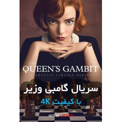
![سریال گامبی وزیر با کیفیت 4K]()
سریال گامبی وزیر با...
3,900,000 ریال